Fashion Colorworks 2016


|
|
The Seventh Fashion Colorworks 2016 Beading Contest finished! This year 85 artists from 16 countries submitted 111 beadworks - less than last year. We are grateful to the bead artists, the members of the jury panel, the sponsors and all the fans and MyLovelyBeads.com visitors for their permanent contribution to the development of bead art. THANK YOU for your patience, creativity and generosity! We hope to hold another Fashion Colorworks in 2017 and look forward to seeing you next year! |
|
Best in Contest Winner
|
|
Best in Contest Runner-up
|
|
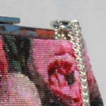
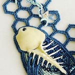
Beaded Jewelry |
|
Finished Jewelry |
|
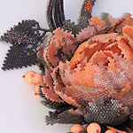
Beaded Objects And Accessories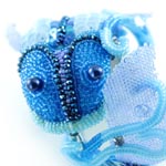
First Place WinnerSvetlana Paranina, Perm, Russia ( email website )
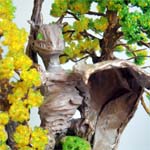
Second Place WinnerKsenia Ivanova, Taganrog, Rostov region, Russia ( email website )
Third Place WinnerTatiana Romanenko, Dnepropetrovsk region, Ukraine ( email )
|
|
People's ChoiceSvetlana Rohloff, Augsburg, Germany ( email website ) |
|
|
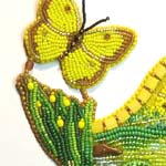
Best Use of ColorSvetlana Paranina, Perm, Russia ( email website ) |
|
Best Use Of Preciosa Traditional Czech Beads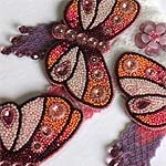
Aleksandra Lysenko, Prague, Czech Republic ( email website )
Elena Korpacheva, Moscow, Russia ( email website )
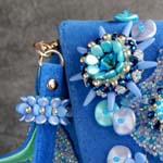
Alina Gorshkova, Solikamsk, Perm region, Russia ( email website )
|
|
|
|
|
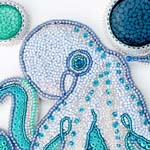
What our jurors saySince 2010, "The International Fashion Colorworks Beading Contest" held by Zoya Gutina of My Lovely Beads offers both professional and amateur bead artisans the opportunity to enter original and current beaded artworks primarily within the guidelines of selected Pantone Annual Colorway choices. Each year entries continue to surprise, delight and inspire. Fresh and exciting technique applications, design, and color interpretations are beautifully expressed in "one-of-a-kind" works. Congratulations to entrants from around the world for their creativity and dedication to their art! As always, it was a pleasure to spend some in-depth and up close, personal time with the innovative and beautiful entries in Zoya's Fashion Colorworks competition. All of the finalists were worthy of the honor, and there were a couple pieces that I was sad to see not included, particularly in the Beaded Jewelry category, and a stroll through all of the entries is time well spent. On to the finalists. A few entries really hit the mark for me. In the Rose Quartz/Peach Echo/ Lilac Gray group, I really loved the density and sophistication of the Winter Rose Necklace in Beaded Jewelry. The mixture of finishes on the beads in the flower especially were so very true-to-hue while providing a great sense of depth. Also from this triad, the micro-macrame Chrysanthemum and Dragon Necklace in Finished Jewelry blew me away with its exceptional textures. The blending of the hues in the petals of the flower and on the dragon's frills are exactly the kind of color play this competition calls for. I thought the Buttercup/Green Flash/Iced Coffee triad was the most challenging, with its nearly eye-watering intensity, but there were many entries that used the colors to great effect. In Spring Miracle (Beaded Jewelry), we see great use of tints and tones of the grassy green in the leaves, and I loved the flower visible in both bud and bloom states. Sunshine Over My Pond (also in Beaded Jewelry) creates a beautiful and believable landscape; a true painting with beads. The stellar gradation in the fringe and the sublime reflection of the sunset reflected on the water with hints of the Iced Coffee hue was nearly magical. Also worthy of special attention in this color triad were Forest Dragon Nest, and Couple Light Reflector in Objects and accessories. Both blended the hues beautifully, and demonstrated great composition. In the Limpet Shell/Serenity/Snorkel Blue triad, I thought the Octo Necklace in Beaded Jewelry did an exceptional job of using value within the given hues to create dimension and depth in the composition. The body and legs of the creature are clearly defined because of that precise play of values, some bits moving forward into the light and others sinking back in shadow. I adored the use of the beads turned sideways to create the tentacles. The elegance and beauty of the lines used to describe the octopus were also a delight. I was finally very excited by the Rainy Venus Flowers Purse (Objects and Accessories). Such a great design, with wonderful flowing lines, and such good use of so many of the new bead shapes, as well as nice textural use of traditional seeds. The project posed challenges a tailor can fully appreciate, and I was very pleased to seen clean edges and superb construction. Again, the entire groups of finalist entries deserve praise! It was my pleasure to review and appreciate beautiful works! For me, the experience of judging in the Fashion Colorworks was the first. Of course, this was a very responsible and, as it turned out, difficult. For each work, I imagined myself - sitting at my lovely table, under my favorite lamp, passionately creating my "bead child." This encouraged me to feel sympathy and love for each contest entry, but at the same time to be critical as I would have been very critical to my own creation. I was very pleased that it was impossible to find faults in the quality of the absolute majority of the works. Lots of interesting entries, pleasing combinations of interesting shapes and materials. Of course, the main criterion for the competition was color palette. In my opinion, it is very difficult to create something in a certain color combination, especially when you cannot make any change, so I particularly admire participants who entered their creations exactly in the specified color triads. Many thanks to the organizers of the contest for inviting me to the panel of judges! I wish the competition to continue to bloom with beautiful creations of talented artists from around the world! |
|
Note
If you don't see the newsletter properly formatted please click here:
Contest Issue.
|
© 2016 MyLovelyBeads.com All Rights Reserved.
If you do not want receive our newsletter and you wish to remove your email address from our mailing list, please click the following link to unsubscribe.